How to Use the Bitcoin Rainbow Chart to Understand Market Cycles

Bitcoin doesn’t move in straight lines. It moves in cycles.
Most people focus only on price. But long-term investors focus on where price sits within a broader valuation structure. The Bitcoin Rainbow Chart is one of the simplest visual tools to understand this.
It doesn’t predict the future. It shows you where Bitcoin stands within historical valuation bands, and how market psychology tends to repeat over time.
Step 1: Open the Bitcoin Rainbow Chart
Go to:
https://www.blockchaincenter.net/bitcoin-rainbow-chart/
As soon as the page loads, you’ll see the first chart titled:
“Bitcoin Rainbow Price Chart (The original chart)”
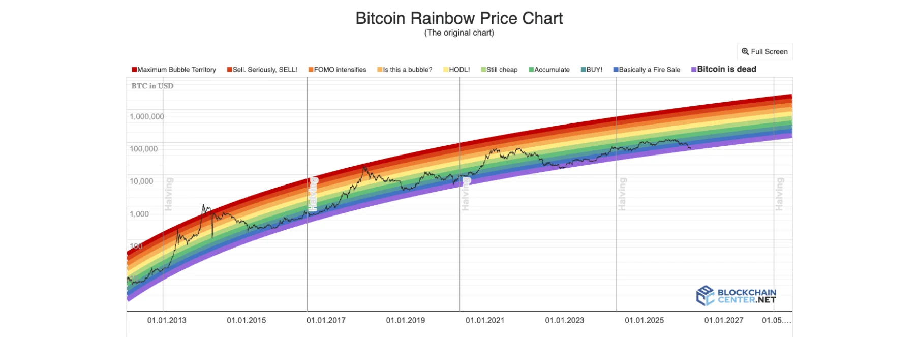
This is a long-term logarithmic Bitcoin price chart with colored valuation bands layered over it.
The colors range from:
Dark blue and purple at the bottom (“Basically a Fire Sale” / “Bitcoin is dead”)
Green and light blue in the middle (“Accumulate”, “Still cheap”)
Yellow and orange above (“HODL”, “Is this a bubble?”)
Red at the top (“Sell. Seriously, SELL!” / “Maximum Bubble Territory”)
The black line is Bitcoin’s actual historical price.
This chart compresses over a decade of price history into a logarithmic growth curve. Instead of showing short-term volatility, it places Bitcoin inside long-term valuation zones.
Historically:
Major bear market bottoms formed in the blue and dark green zones.
Bull market peaks approached or entered the red zones.
This makes the rainbow chart a visual model of long-term cycle psychology.
It helps answer one key question:
Are we historically undervalued, fairly valued, or overheated?
In addition, if you would like to learn How to See Bitcoin Fees Over Long Periods, check it out on the bitcoin everlight education section.
Step 2: Scroll Down to the Second Rainbow Chart (Cycle View with Halvings)
Scroll down and you’ll find another version of the Bitcoin Rainbow Chart.
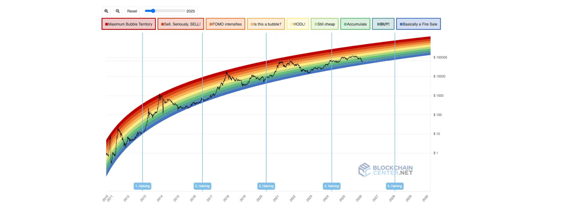
This version includes:
Clear vertical markers for each Bitcoin halving
The same valuation color bands
A visible time slider at the top
Cycle labels beneath the chart
This chart emphasizes something important:
Bitcoin’s growth historically aligns with halving cycles.
Each halving reduces new supply issuance, and historically, strong bull markets followed in the years after.
The second chart helps you visually compare:
Where price peaked relative to previous halvings
How long accumulation phases lasted
How quickly price moved between valuation bands
It connects three core ideas:
Halving supply shocks
Logarithmic long-term growth
Repeating psychological extremes
This version makes the cyclical nature of Bitcoin much clearer.
Why This Indicator Matters
The Rainbow Chart is not a technical indicator like RSI or moving averages.
It is a long-term valuation framework built around logarithmic regression. That means it assumes Bitcoin grows over time but with diminishing percentage returns.
It matters because:
It removes short-term noise.
It places today’s price inside historical context.
It visually shows how greed and fear repeat across cycles.
It connects price movement with halving events.
Instead of asking, “Is Bitcoin up 5% today?”
You start asking, “Where are we in the long-term cycle structure?”
That’s a completely different mindset.
Conclusion
The Bitcoin Rainbow Chart is a psychological map of Bitcoin’s history.
It doesn’t tell you what happens tomorrow. But it clearly shows where previous cycles overheated and where deep value zones formed.
If you want to understand Bitcoin beyond daily volatility, zoom out. Look at the rainbow bands. Compare cycles around halvings.
Price fluctuates.
Cycles repeat.