How to See Bitcoin Fees Over Long Periods (Macro View)

Bitcoin fees tell a story most people ignore.
When fees spike, it usually means congestion, demand, speculation, or structural shifts in network usage. When fees remain low for extended periods, it signals reduced pressure on block space.
If you want to understand Bitcoin beyond price action, tracking transaction fees over long periods gives you insight into network demand, adoption waves, and market cycles.
Here’s how to analyze it properly using YCharts.
Step 1: Go to the Bitcoin Average Transaction Fee Page
Open:
https://ycharts.com/indicators/bitcoin_average_transaction_fee
This page tracks Bitcoin’s average transaction fee in USD per transaction, updated daily.
This is your starting point for analyzing fee behavior across different timeframes.
Step 2: Analyze the Overview, Level Chart, and Historical Data
When you land on the page, you’ll see:
The current Bitcoin Average Transaction Fee (in USD per transaction)
The “Overview” tab
The “Level Chart”
The “Historical Data” table
The Level Chart allows you to switch between timeframes such as 1Y, 3Y, 5Y, 10Y, and MAX. This is where the macro perspective becomes powerful.
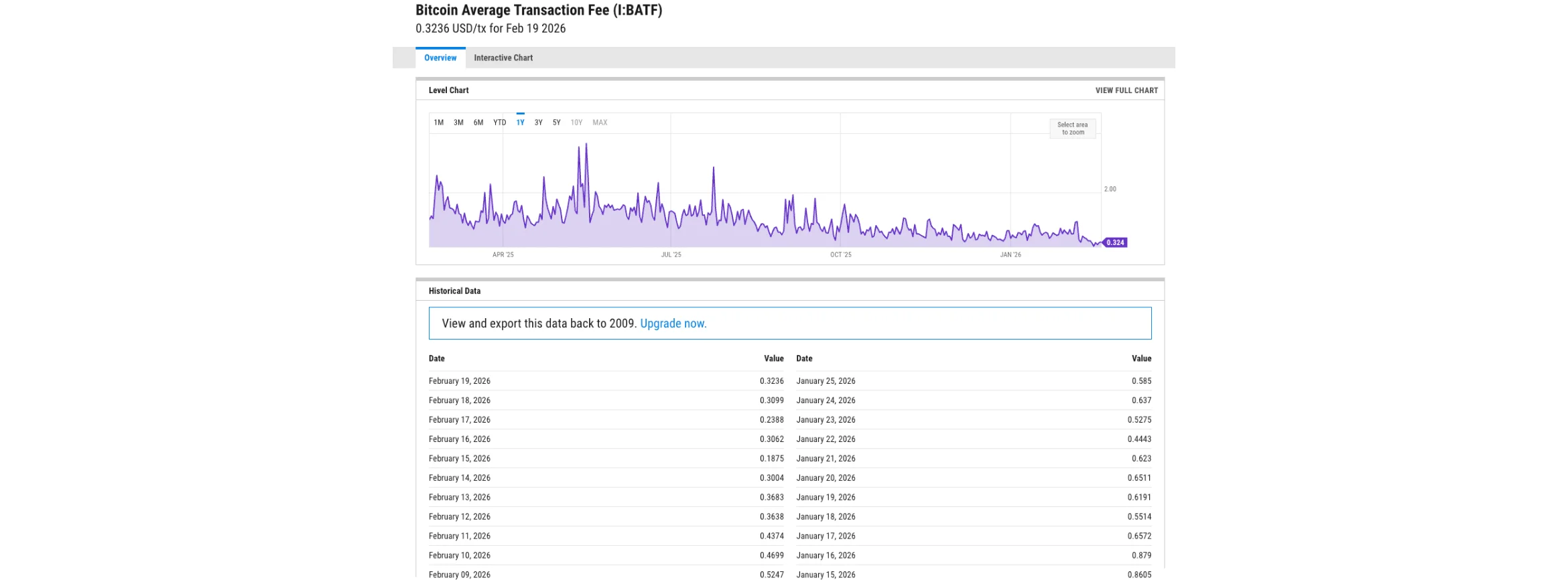
Over longer timeframes, you’ll notice:
Major fee spikes during bull markets
Lower sustained fees during quieter market periods
Gradual normalization after congestion phases
This helps you connect fee behavior with broader market cycles.
Below the chart, the Historical Data table shows the exact daily values. This is useful if you want to compare specific periods or analyze short-term changes within a macro context.
The combination of chart + raw data allows both visual and numerical analysis.
Step 3: Scroll Down to Basic Info and Stats
Scroll to the bottom right of the page.

There, you’ll see two sections:
Basic Info
This explains what the metric represents:
Bitcoin Average Transaction Fee measures the average fee in USD when a Bitcoin transaction is processed and confirmed by miners.
It also provides context, for example, noting that fees can spike significantly during periods of heavy congestion, such as the 2017 crypto boom.
Stats
This section shows:
Last value
Latest period
Change from yesterday
Change from 1 year ago
Growth rate
Frequency (Daily)
Unit (USD per transaction)
Formula used for calculation
This is important because it tells you:
Whether fees are rising or falling
How current levels compare historically
Whether the change is short-term noise or part of a larger trend
This transforms the chart from just a visual into measurable data.
In addition, if you would like to learn How to Track Bitcoin Network Growth Using Nodes, check it out on the bitcoin everlight education section
Why This Matters
Transaction fees reflect demand for block space.
When fees rise sharply, it usually means increased on-chain activity, often during speculative waves, NFT/inscription trends, or bull markets. When fees decline, it can signal reduced activity or improved network efficiency.
By looking at fees in a macro timeframe instead of daily fluctuations, you can:
Identify periods of extreme congestion
Compare current network demand to previous cycles
Understand whether the network is under structural pressure
Fees are one of the clearest indicators of real usage, not price speculation.
Conclusion
Bitcoin fees are more than just transaction costs, they are signals of network demand.
Using YCharts to zoom out and analyze long-term fee behavior gives you a structural perspective on Bitcoin’s activity cycles. Instead of reacting to short-term spikes, you gain context across years.
Price tells you what the market thinks.
Fees tell you how the network is being used.