How to Track Bitcoin Network Growth Using Nodes

Bitcoin’s price moves fast. Headlines move faster.
But what really shows the health of the network is something much deeper: nodes.
Nodes are the backbone of Bitcoin. They validate transactions, enforce consensus rules, and keep the network decentralized. If you want to understand whether Bitcoin is strong, growing, or centralizing, you don’t look at price, you look at nodes.
In this guide, we’ll use Bitnodes.io to track Bitcoin’s network growth, geographic distribution, and software diversity in just a few minutes.
Step 1: Open Bitnodes.io and View the Global Node Map
Go to:
On the homepage, you’ll immediately see:
The total number of reachable Bitcoin nodes
A breakdown of IPv4, IPv6, and onion nodes
A world map showing geographic distribution
A Top 10 country ranking by node count
This is your high-level overview of Bitcoin’s global infrastructure.
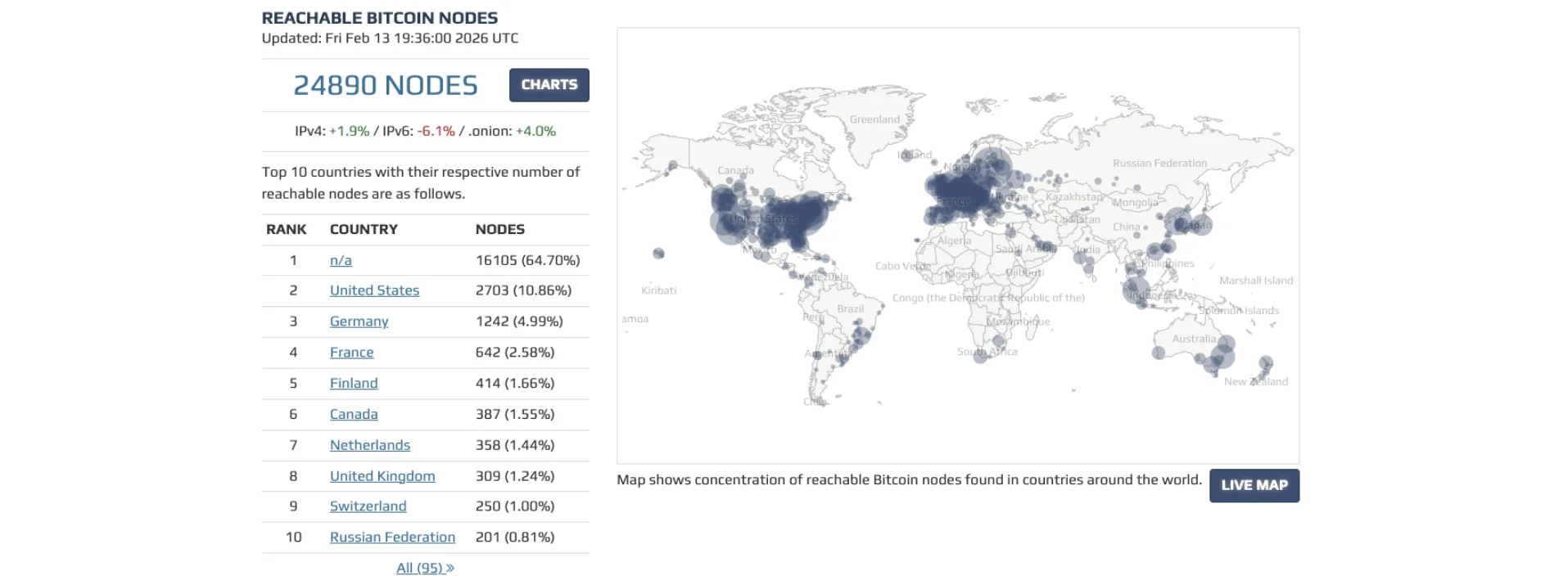
The world map visually shows where nodes are concentrated. Large clusters in regions like North America and Europe indicate strong participation. The broader and more distributed the map looks, the more geographically decentralized the network is.
The country ranking below it gives more context. If node concentration is too heavily skewed toward one region, decentralization risk increases. If many countries are represented, that’s a structural strength.
This single page already tells you:
How large the network is
Where it’s strongest
Whether participation is globally spread
Step 2: Click “Charts” to Analyze Network Growth Over Time
Next to the total node count, click the “Charts” button.
This takes you to two key sections.
Nodes Chart (IPv4, IPv6, Onion)
The first chart shows the number of reachable Bitcoin nodes over time, split into:
IPv4
IPv6
Onion (Tor)
This is where you measure growth.
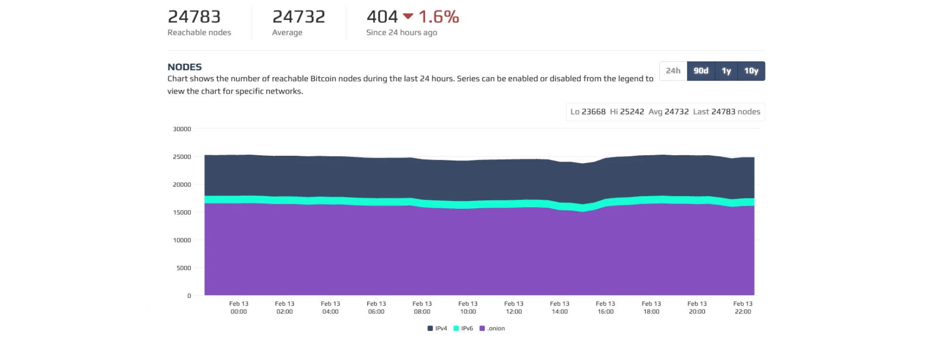
If total nodes are stable or increasing, the network is healthy.
If onion nodes grow, privacy adoption is increasing.
If IPv6 adoption grows, infrastructure modernization is happening.
Short-term fluctuations are normal. What matters is long-term stability and upward trend.
This chart shows whether Bitcoin’s infrastructure is expanding or shrinking, something price alone cannot tell you.
User Agents Chart (Client Distribution)
Scroll slightly down and you’ll see the User Agents chart.
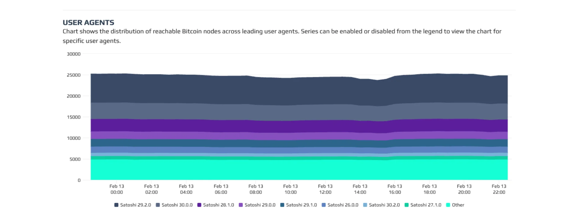
This shows which Bitcoin software versions nodes are running (for example, different Bitcoin Core versions).
This is critical.
If most nodes run one version, and upgrades are adopted smoothly over time, that indicates coordinated and healthy software evolution.
If adoption is fractured or outdated versions dominate, that can signal fragmentation risk.
This chart answers an important question:
Is Bitcoin evolving safely and uniformly?
Why Node Growth and Distribution Matter
Bitcoin’s strength is not just in market cap, it’s in decentralization.
More nodes mean:
More independent validators
More rule enforcement
Greater censorship resistance
Stronger consensus security
Geographic diversity reduces political risk.
Onion node growth increases privacy.
Healthy client distribution shows coordinated protocol upgrades.
A strong Bitcoin network is one that is widely distributed, technically updated, and consistently validated by thousands of independent participants.
Bitnodes lets you see all of that in real time.
In addition, if you would like to learn How to Check the Bitcoin Fear & Greed Index Properly (And Use It the Right Way), check it out in the Bitcoin Everlight education section.
Conclusion
If you want to understand Bitcoin beyond price charts, start tracking nodes.
The node map shows decentralization.
The growth chart shows network strength.
The user agent chart shows software health.
Together, they give you a structural view of Bitcoin’s backbone, the infrastructure that keeps it alive.
Price is noise.
Nodes are foundation.