How to Use the Puell Multiple to Identify Bitcoin Market Cycles (Undervalued vs Overheated Zones)

Most people look at Bitcoin price and try to guess what happens next. Smart investors look deeper , they analyze market conditions behind the price.
The Puell Multiple is one of the most powerful indicators for this. It helps you understand whether Bitcoin is currently cheap, fairly valued, or overheated, based on historical behavior.
In this guide, you’ll learn how to use the Puell Multiple on Bitbo to read Bitcoin market cycles more clearly.
Step 1: Go to the Puell Multiple Chart
Start by visiting:
👉 https://https://charts.bitbo.io/panels/
Once you're on the site:
Look at the left-hand sidebar
Go to the “Mining” section
Click on “Puell Multiple”
This will open the full chart showing the indicator over time.
Step 2: Understand the Puell Multiple Chart
When you open the chart, you’ll see two main lines:
Yellow line → Puell Multiple
Green line → Bitcoin price
The Puell Multiple measures how current conditions compare to historical averages.
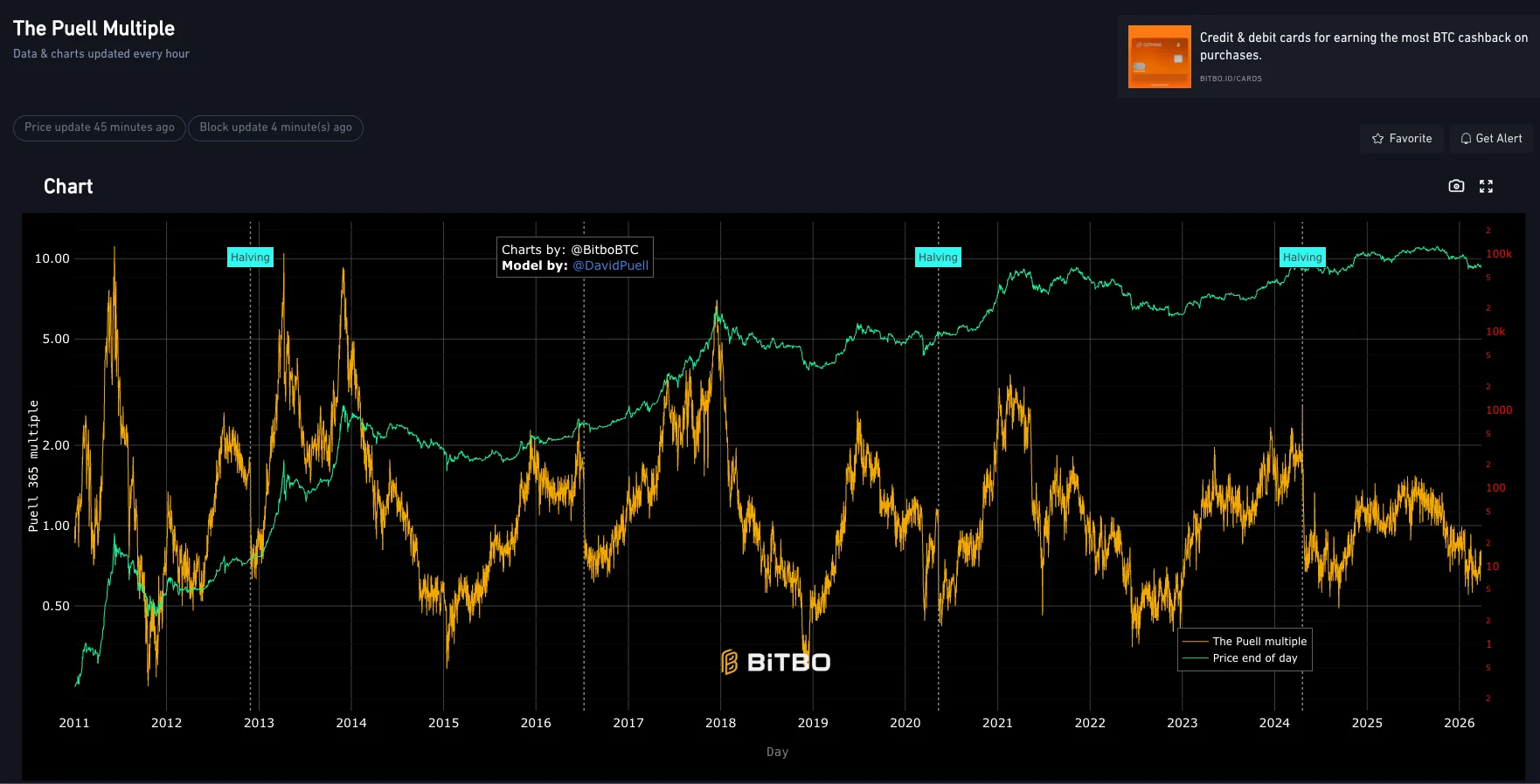
How to Read It:
Low values (near or below ~1):
Historically associated with undervalued zones
Often appear during bear markets or accumulation phases
High values (above ~3–4+):
Associated with overheated markets
Often appear near cycle tops
Mid-range values:
Neutral market conditions
Transition between accumulation and distribution
You’ll also notice vertical markers (like halvings), which help you understand how this indicator behaves across different Bitcoin cycles.
In addition, if you would like to learn How to Measure Bitcoin HODL Waves (Understand Investor Behavior), check it out on the Bitcoin Everlight education section.
Step 3: Use the Interactive Chart (Hover for Insights)
The real power of this chart comes when you interact with it.
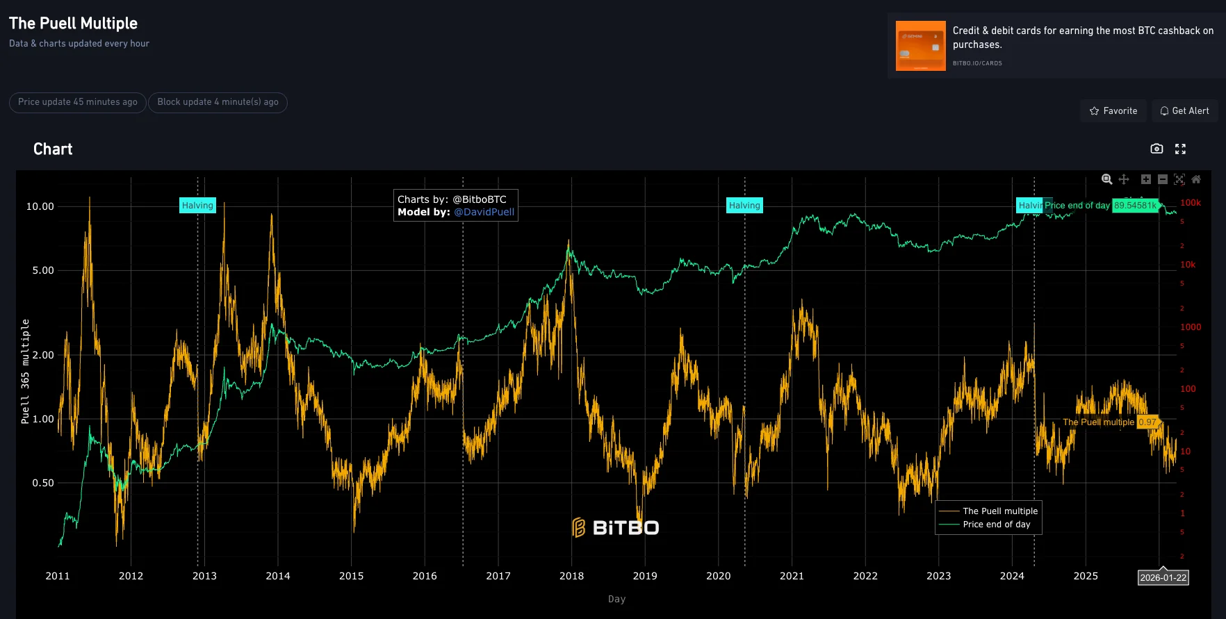
When you move your mouse over any point, you’ll see:
The exact Puell Multiple value at that time
The Bitcoin price at that moment
The specific date in the cycle
This allows you to:
Compare different cycles side by side
See exactly where previous tops and bottoms formed
Understand how extreme the current market really is
For example:
If you hover near a past peak, you’ll notice very high values
If you hover near a bottom, values tend to be very low
This gives you context that price charts alone simply can’t provide.
Why This Is Important
The Puell Multiple helps you avoid one of the biggest mistakes in crypto: reacting emotionally to price.
Instead of guessing, you can rely on historical patterns:
When the indicator is low → market may be undervalued
When it spikes → risk of overheating increases
When it’s neutral → market is in transition
This gives you a clearer framework for:
Timing long-term entries
Avoiding buying at peak hype
Understanding where we are in the cycle
It’s not about predicting exact tops or bottoms , it’s about making smarter decisions with better context.
Conclusion
The Puell Multiple is a simple but powerful tool that reveals what most investors miss: the condition of the market, not just the price.
By using this chart regularly, you can start recognizing patterns that repeat every cycle , and position yourself accordingly.
If you want to think long-term and avoid emotional decisions, this is one indicator you should definitely keep in your toolkit.