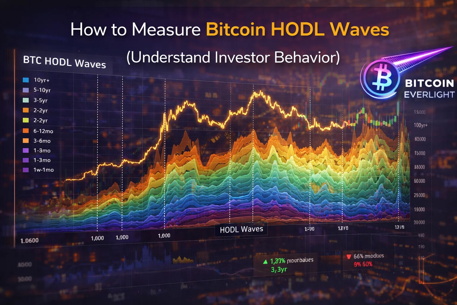
How to Measure Bitcoin HODL Waves (Understand Investor Behavior)
Understanding Bitcoin isn’t just about price, it’s about behavior. One of the most powerful ways to analyze long-term market trends is by tracking how long investors hold their BTC.
HODL Waves visualize this behavior by breaking down Bitcoin supply based on how long it has remained untouched. This allows you to see whether investors are accumulating, holding, or selling, giving you a deeper look into market cycles beyond simple price charts.
Step 1: Go to the HODL Waves Chart
Start by visiting the website:
https://https://charts.bitbo.io/panels/
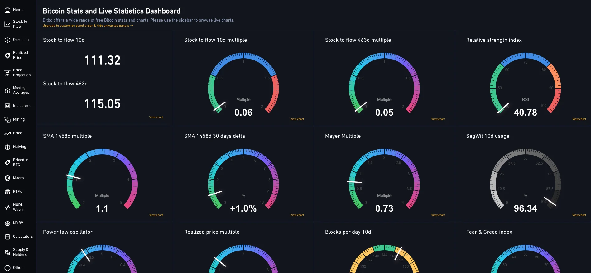
This will take you directly to the BITBO panel that will have many different indicators and charts that we will explain in more detail in the future, for now we will need to navigate to the Bitcoin HODL Waves chart, where you can analyze how BTC supply is distributed across different holding periods.
Step 2: Explore and Understand the HODL Waves Chart
Once you enter the page, you’ll see a large, colorful stacked chart. Each color represents a group of Bitcoin holders based on how long they’ve held their coins.
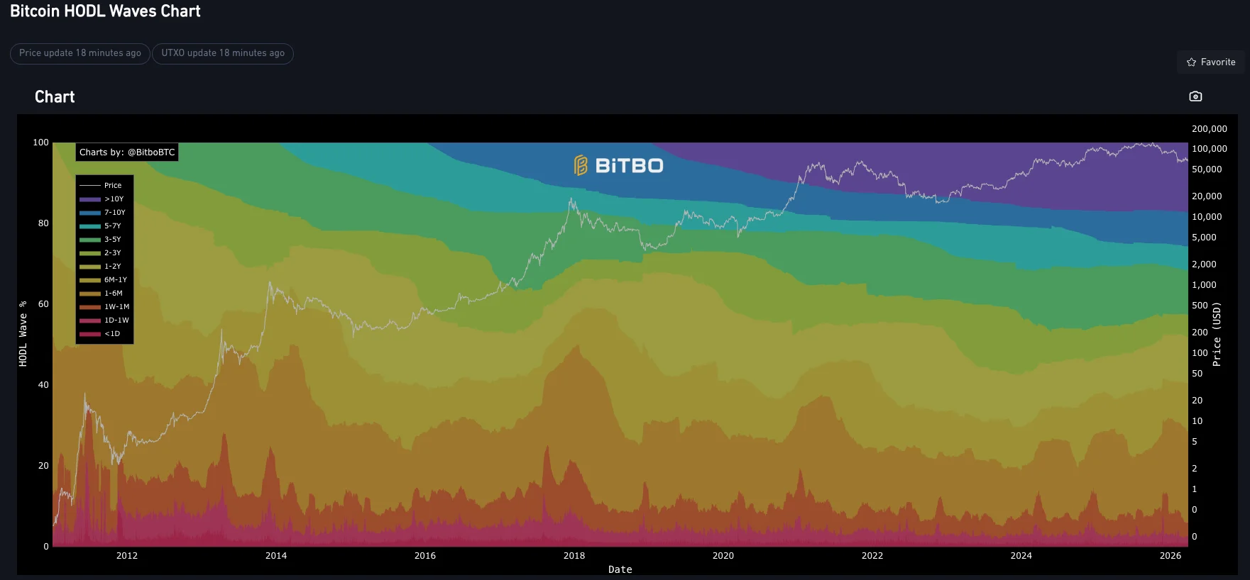
Here’s how to read it:
Each colored band = a holding period
Short-term holders (days to weeks) appear at the bottom
Long-term holders (months to years) appear at the top
Thicker bands = more BTC in that category
If long-term bands grow → investors are holding (bullish behavior)
If short-term bands grow → more coins are moving (potential selling pressure)
Price overlay (white line)
Shows how Bitcoin price moves relative to holding behavior
Helps you connect investor actions with market cycles
Cycle patterns
During bull markets: long-term holders start distributing (bands shrink)
During bear markets: accumulation happens (long-term bands expand)
This chart essentially shows who is holding vs who is selling, which is one of the most important signals in crypto.
Also, if you would like to learn How to Use Bitcoin Average Buy Profit Ratio to Understand Market Sentiment, check it out on the Bitcoin Everlight education section.
Why This Is Important
HODL Waves give you something price charts cannot: context.
Instead of reacting emotionally to price movements, you can see what experienced investors are doing behind the scenes. When long-term holders are accumulating, it often signals confidence and potential future growth. When they start distributing, it can indicate that the market is overheating.
This helps you:
Identify accumulation phases early
Avoid buying at peak hype
Understand real market sentiment
Make more informed long-term decisions
In simple terms, you’re no longer guessing, you’re following the behavior of the market itself.
Conclusion
Bitcoin HODL Waves are one of the simplest yet most powerful on-chain tools available. With just one chart, you can understand investor psychology, track accumulation trends, and spot major shifts in the market cycle.
If you want to move beyond basic price analysis and start thinking like a long-term investor, this is a tool you should be using regularly.