How Bitcoin Fees, Blocks, and Hashrate Connect (Explained Visually)
How Bitcoin Fees, Blocks, and Hashrate Connect (Explained Visually)
Most people look at Bitcoin and only see the price chart. But the network has its own “vital signs”, and three of the most important ones are fees, blocks, and hashrate.
The good news: you don’t need technical tools or coding to understand how they connect. You can see the relationship visually using a single page that updates with live network stats.
This guide walks you through the exact metrics (and charts) that make the connection obvious.
Step 1: Open the Visual Dashboard (BitInfoCharts)
Go to: bitinfocharts.com/bitcoin
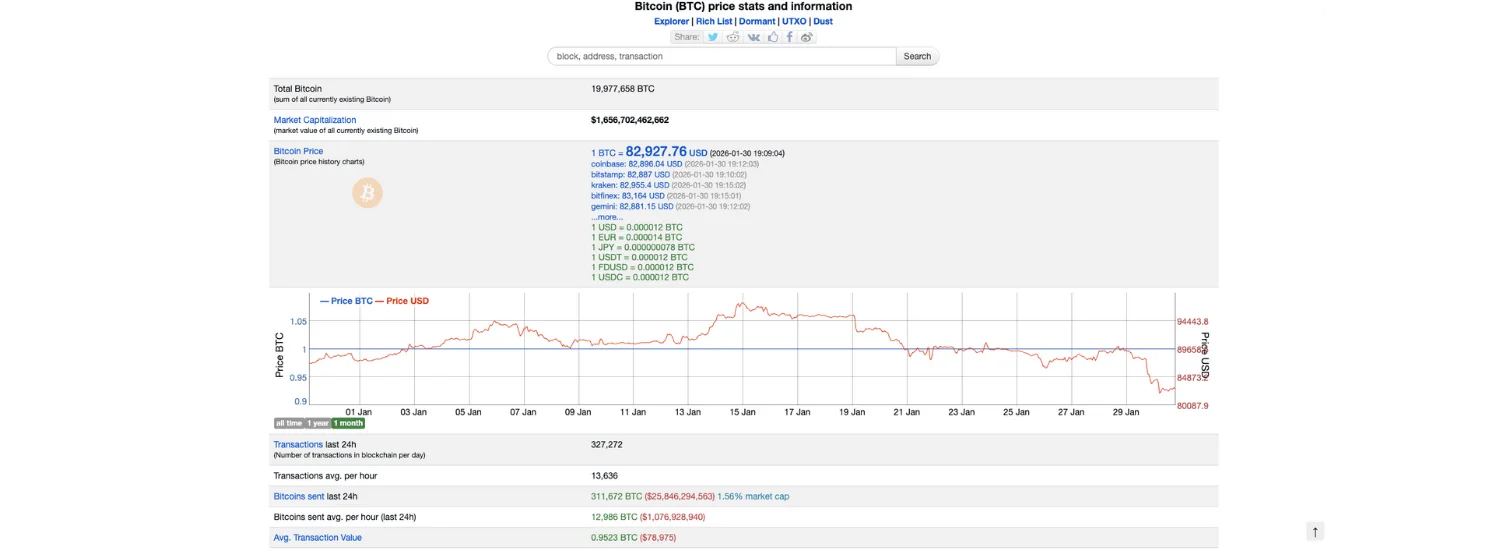
This page is basically a live dashboard for Bitcoin. At the top, you’ll see “big picture” context:
Total Bitcoin (how many BTC exist right now)
Market capitalization
Bitcoin price shown across multiple exchanges
A price chart with time filters (like 1 month, 1 year, all time)
This top area isn’t the main point of our guide, it’s just the starting context. The real value starts when you scroll down into the network metrics.
Step 2: Use the Fee Histogram to Understand “Block Space Demand”
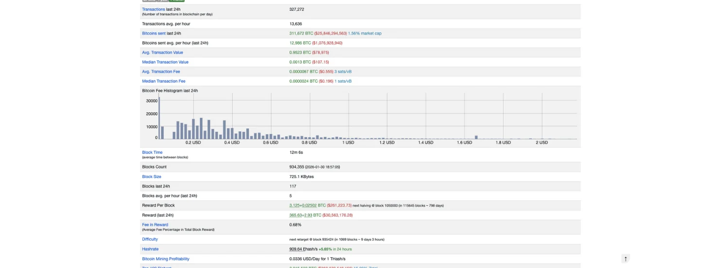
Scroll down to the section where you see transaction and fee stats, especially:
Transactions (last 24h) and Transactions avg. per hour
Avg. Transaction Fee and Median Transaction Fee
Bitcoin Fee Histogram (last 24h)
What the fee histogram is actually showing (in plain English)
Think of Bitcoin blocks like “limited seats” every ~10 minutes.
When more people want seats at the same time, they start bidding higher fees to get included faster.
So the histogram is basically a visual answer to this question:
“What fee levels were people actually paying in the last 24 hours?”
If you see fees concentrated at lower levels, it usually means demand for block space is calm.
If the histogram shifts toward higher fee ranges, it usually means demand is higher and people are competing to get into blocks.
This is one connection
Fees rise when block space demand rises.
And block space is delivered through… blocks.
So the histogram is step one in understanding how the network pressure translates into block behavior.
Step 3: Connect Fees to Blocks, Then Blocks to Hashrate (The Mining Side)
You’ll see metrics like:
A) Blocks & Timing
Block Time (average time between blocks)
Blocks Count
Block Size
Blocks last 24h
Why this matters:
When the network is busy, blocks tend to be more “valuable,” because they can contain more fee-paying transactions. That often goes together with fuller blocks and higher fee pressure.
Block Size helps you understand how packed blocks are.
Block Time tells you how fast blocks are arriving recently (compared to the ~10 minute target).
B) Fees vs Mining Reward
Reward Per Block
Reward (last 24h)
Fee in Reward (very important)
“Fee in Reward” tells you how much of miners’ income is coming from fees rather than issuance.
So if fees are rising (Step 2), you’ll often see “Fee in Reward” increase too.
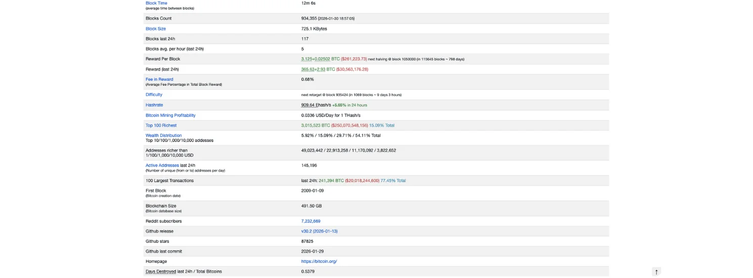
C) Hashrate & Difficulty (Network Security / Mining Competition)
Hashrate
Difficulty
(And often the “next retarget” timing)
These are not “fee tools,” but they explain what’s happening on the mining side.
Second connection:
Hashrate affects block production speed (temporarily).
Difficulty corrects it over time to bring block time back toward ~10 minutes.
And this matters for fees because:
If blocks are arriving slower than usual (before difficulty adjusts), the network can feel more congested.
If blocks are arriving faster than usual, backlog clears faster and fee pressure can ease.
Putting It All Together (The Visual Logic Chain)
Using the page top-to-bottom, you can think of it like one chain:
Fee Histogram shows how intense the competition is for block space (demand side)
Block metrics show how that demand is being processed (supply of block space)
Hashrate & difficulty explain the mining engine that produces blocks (security + production dynamics)
Fee in Reward shows the result: how much fees actually mattered to miners recently
Conclusion
If you only watch Bitcoin’s price, you’re missing the machine underneath it.
By using the visuals on bitinfocharts.com/bitcoin, you can understand Bitcoin’s network through three connected lenses:
Fees show demand for block space
Blocks show the limited supply of space every ~10 minutes
Hashrate (and difficulty) show how the mining engine produces blocks and maintains timing
Once you see these metrics together, Bitcoin stops looking like a mystery chart, and starts looking like a real system with visible cause and effect.
Also, if you would like to learn How to Estimate Bitcoin Fees Using a Fee Estimator (Step-by-Step Guide), check it out on the Bitcoin Everlight education section.